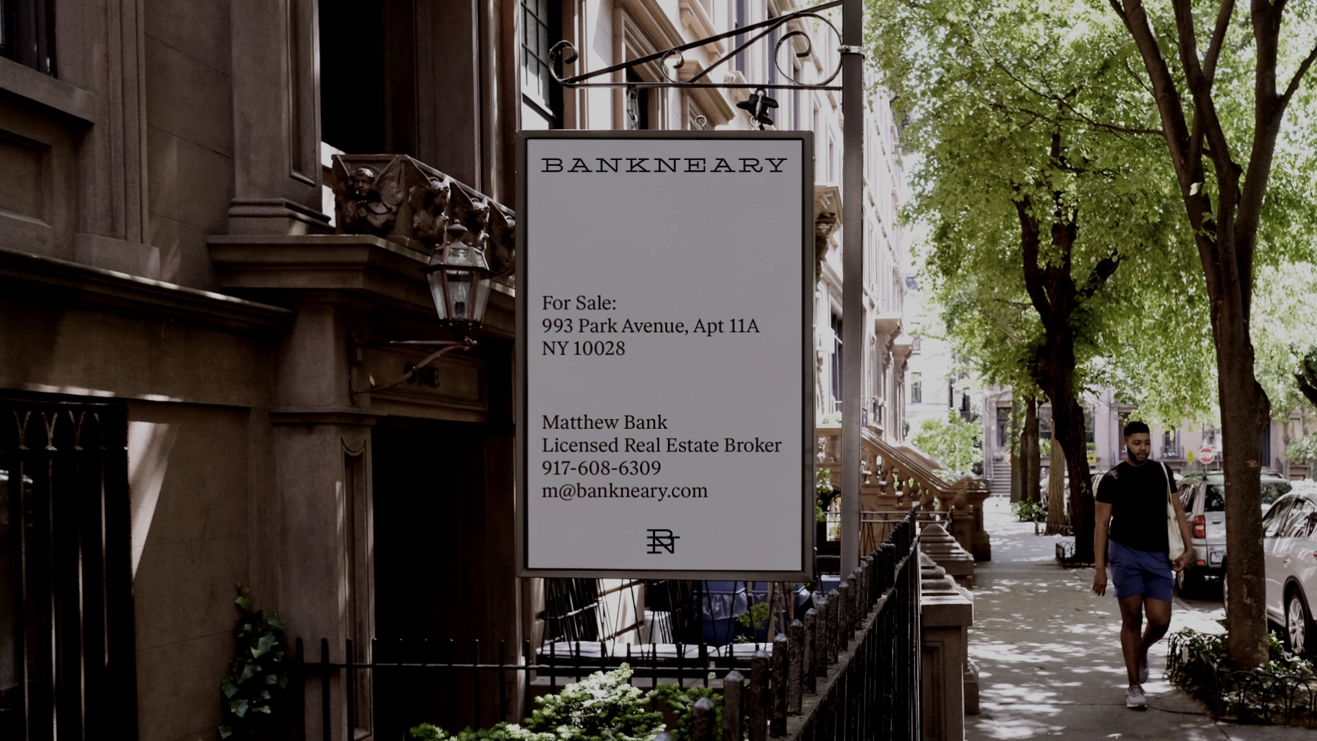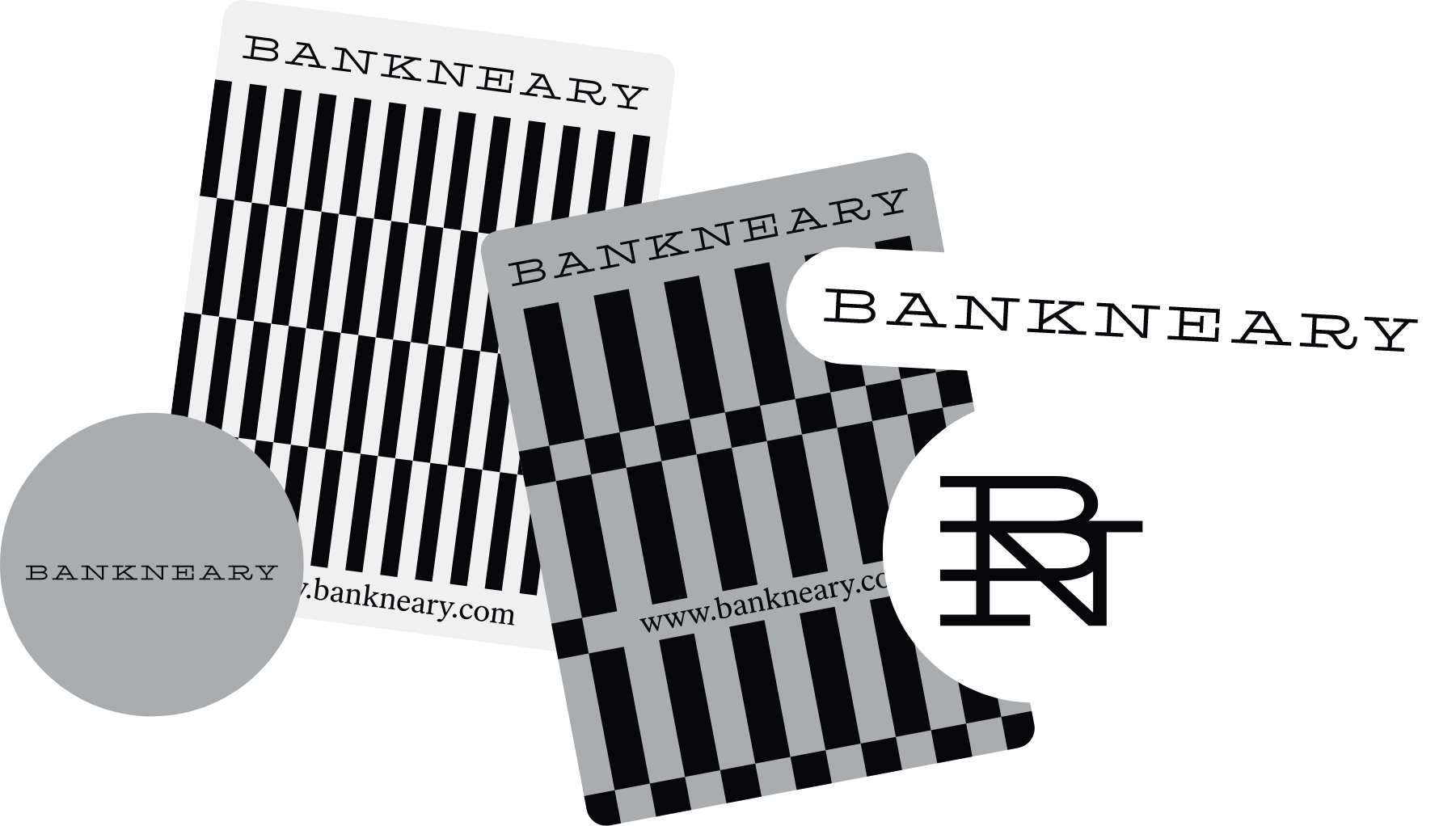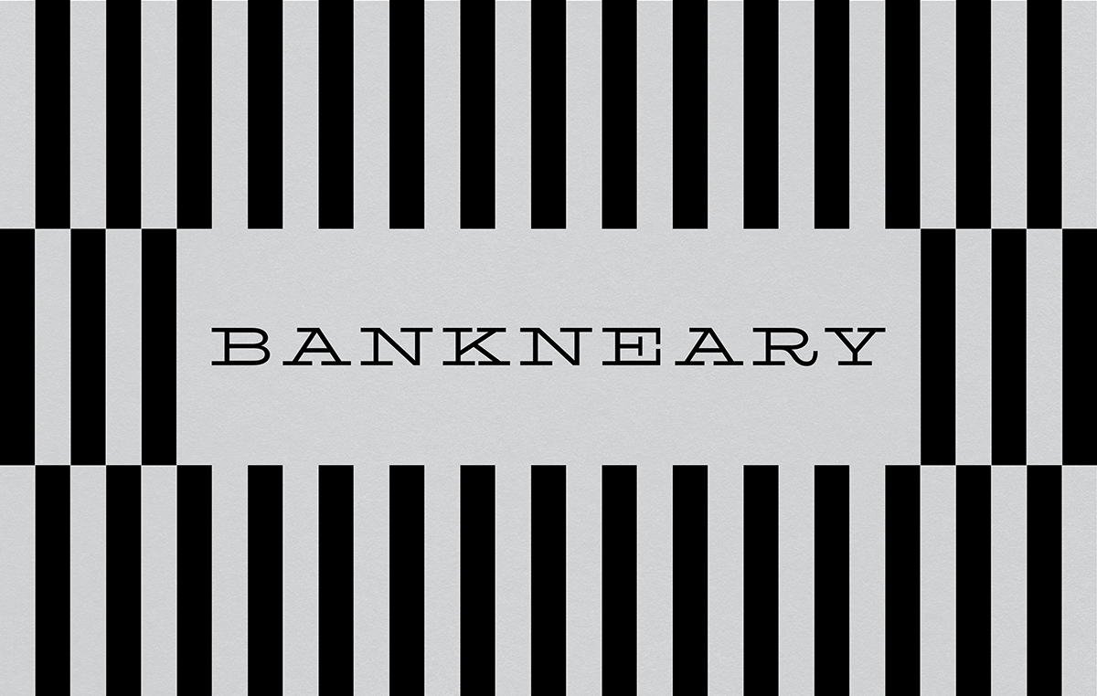
Bankneary, Branding, 2026
35-years of brokerage in New York City with a loyal client base and a genuinely personal way of doing business. Bankneary was in need of an identity refresh that reads established, trusted, and premium.
One problem was in the naming, the two words are the last names of the founders, but generally people thought it's a bank, by simply merging the two last names together into one, Bankneary was born.
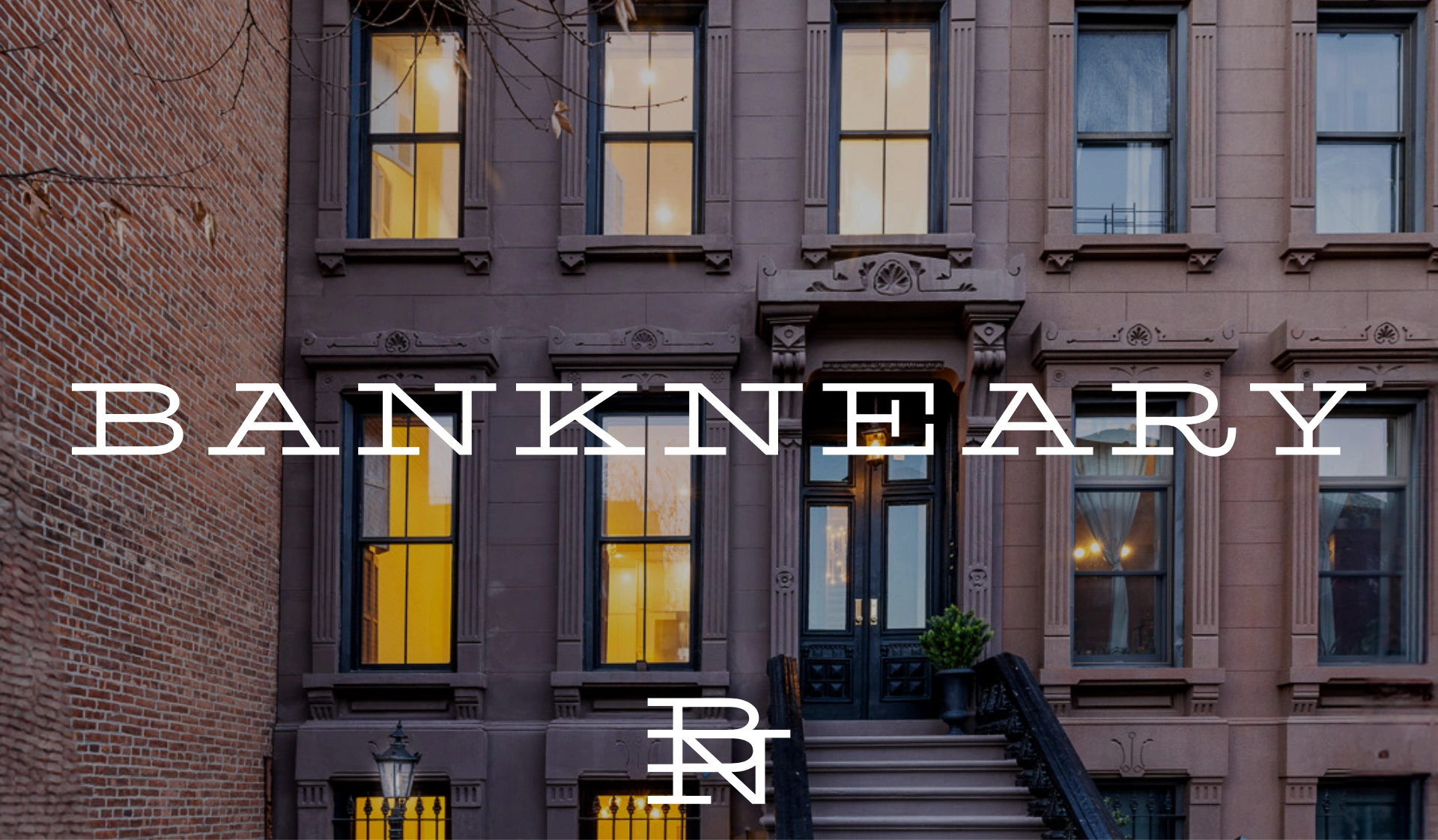
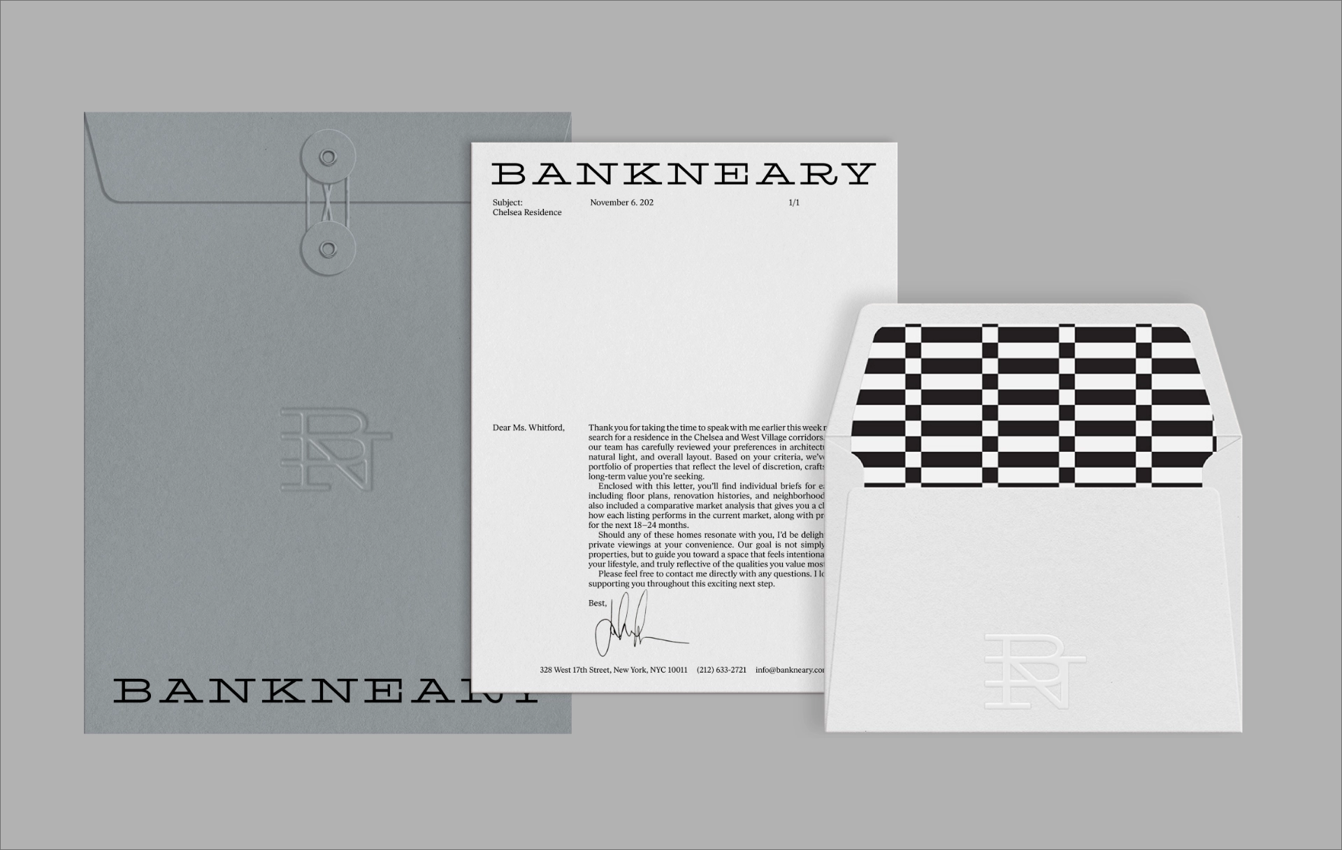
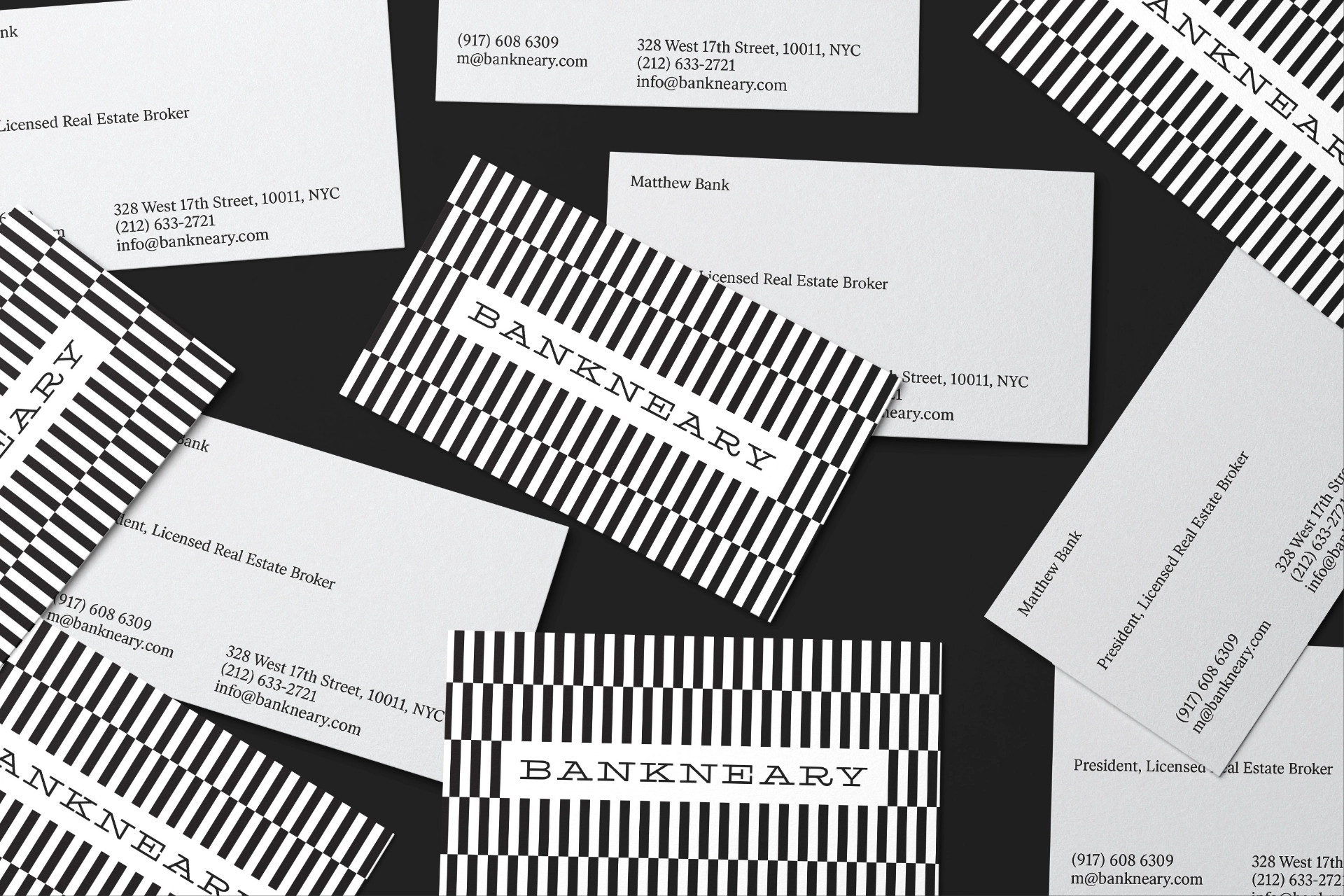
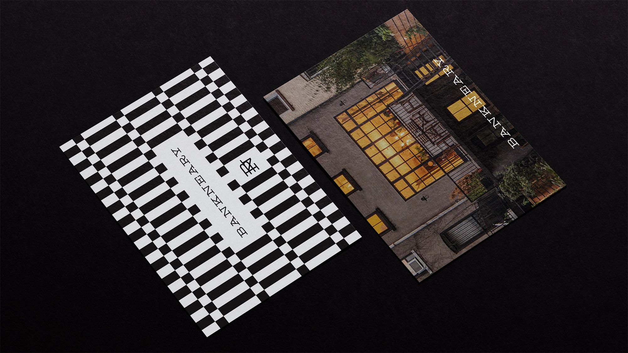
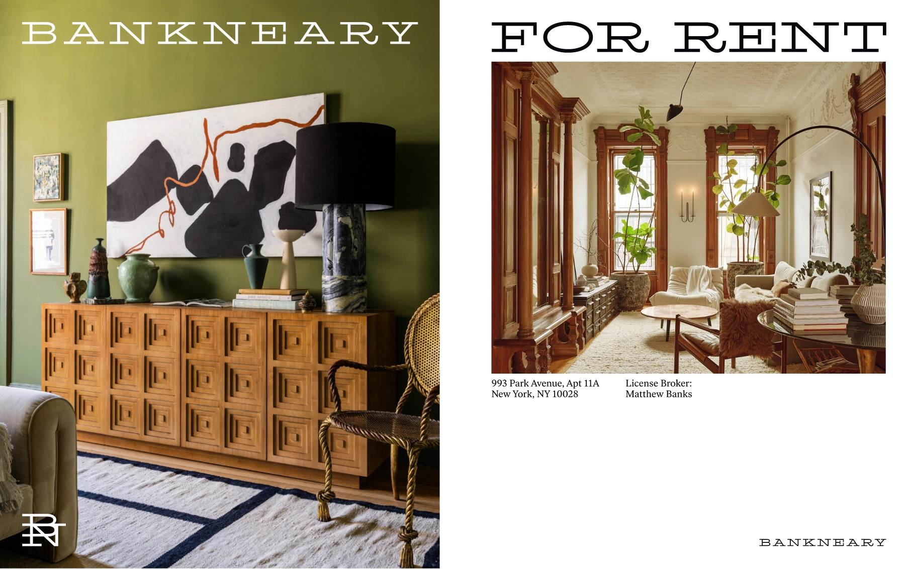
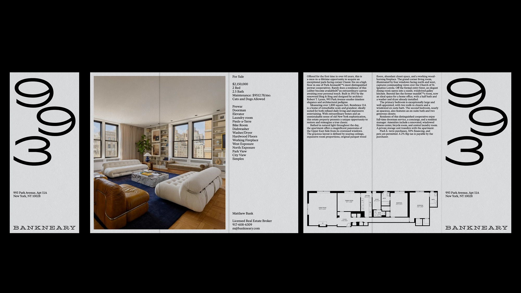
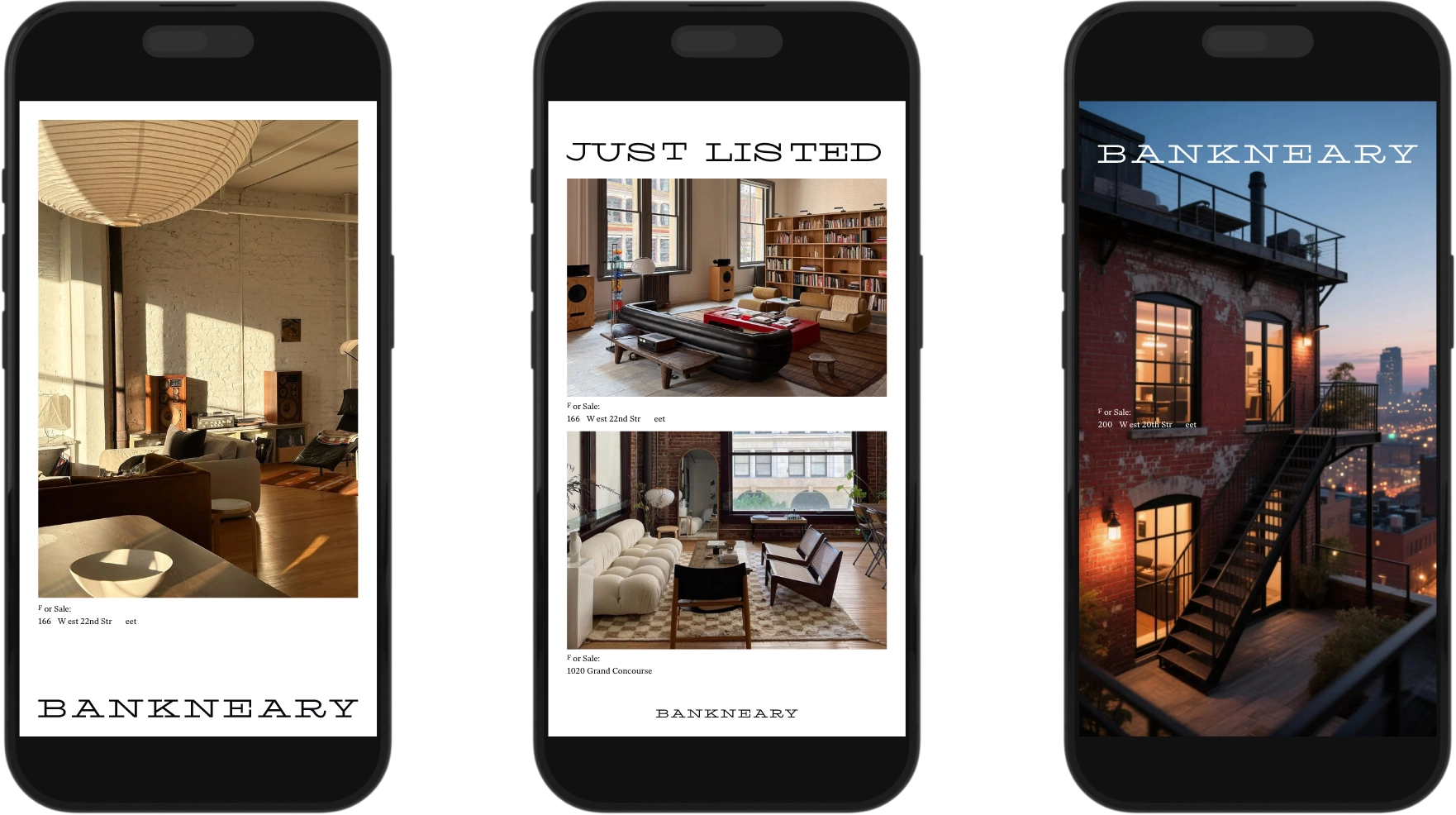
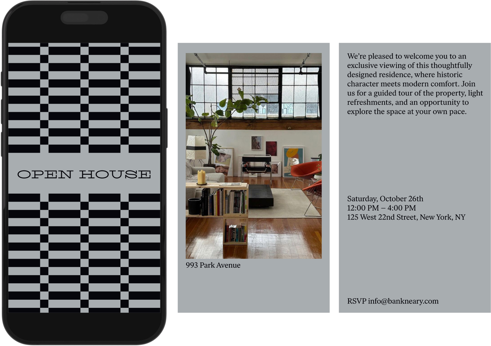
Typographically we wanted to create a wordmark and monogram that screams New York City and still stays classic, modern and beautiful. The visual identity reads as established, personal, and quietly premium at every size. It's a system built to last as long as the relationships it represents.
Services Provided:
Positioning
Strategy
Branding